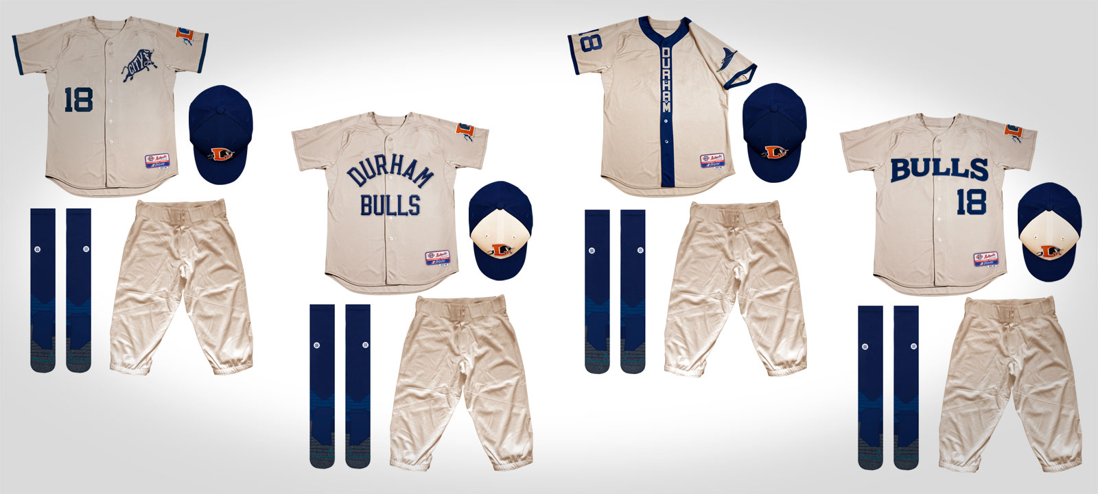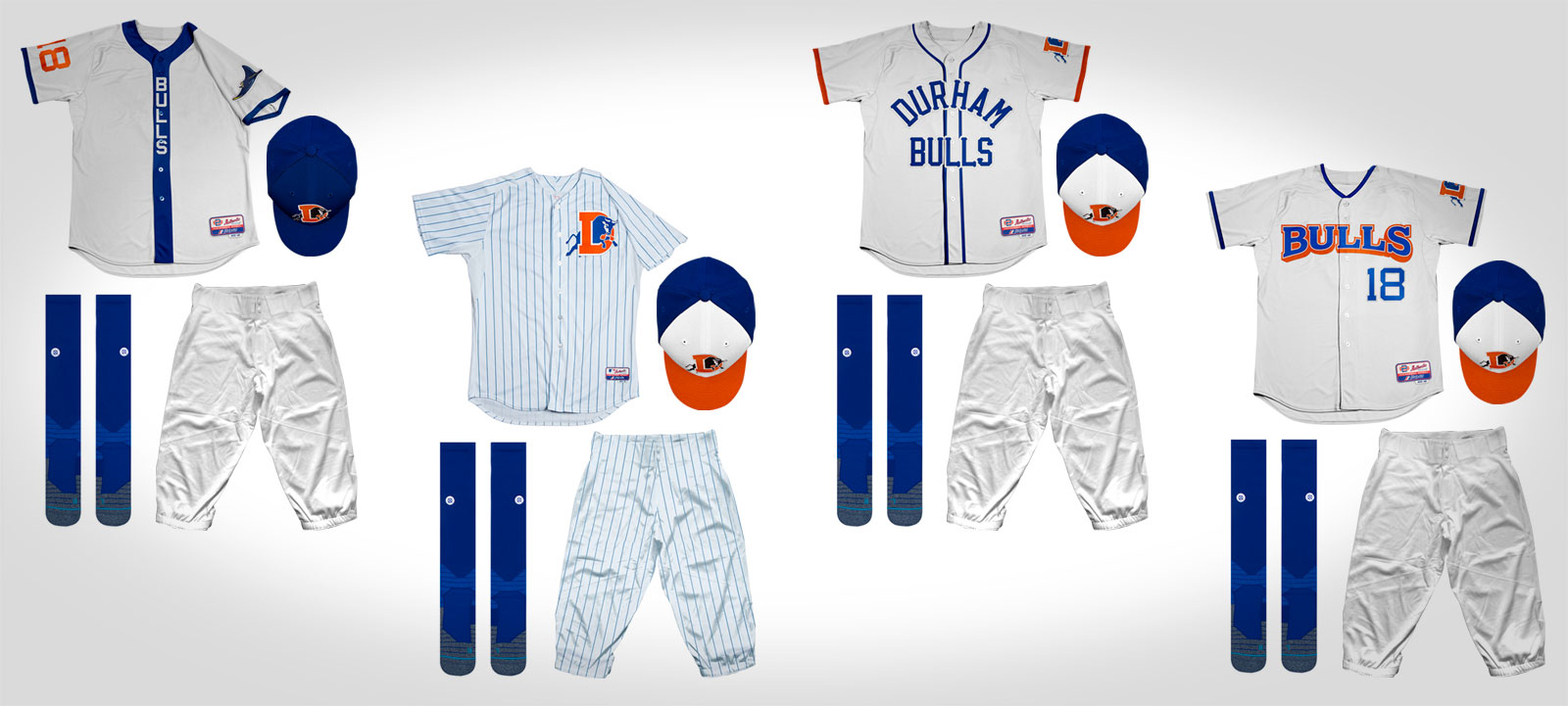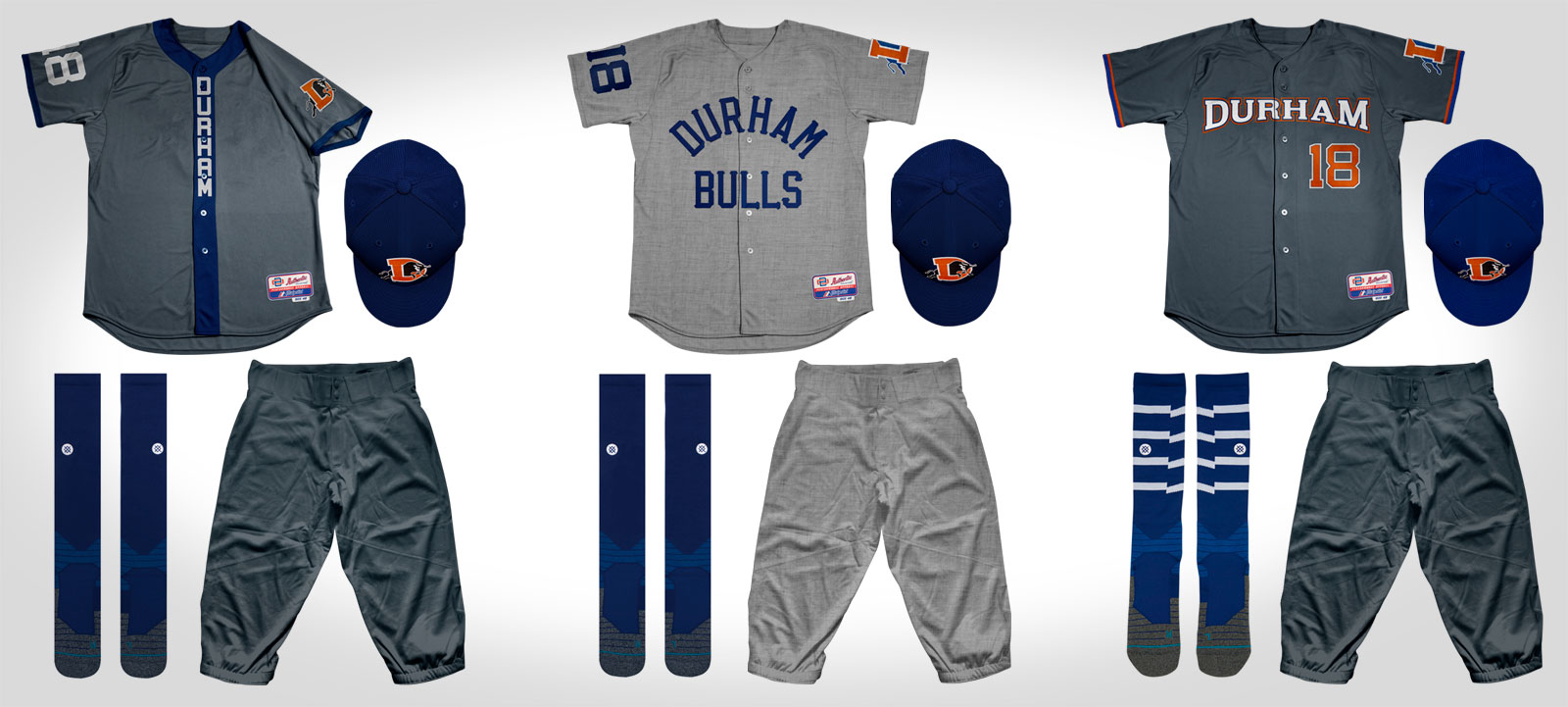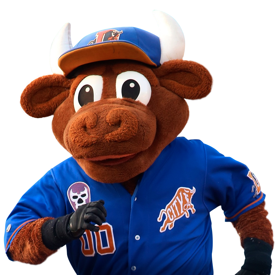
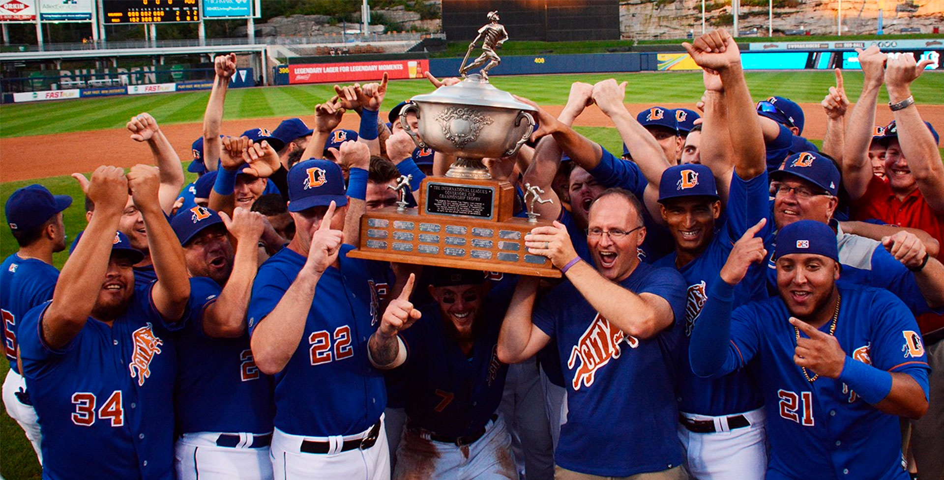
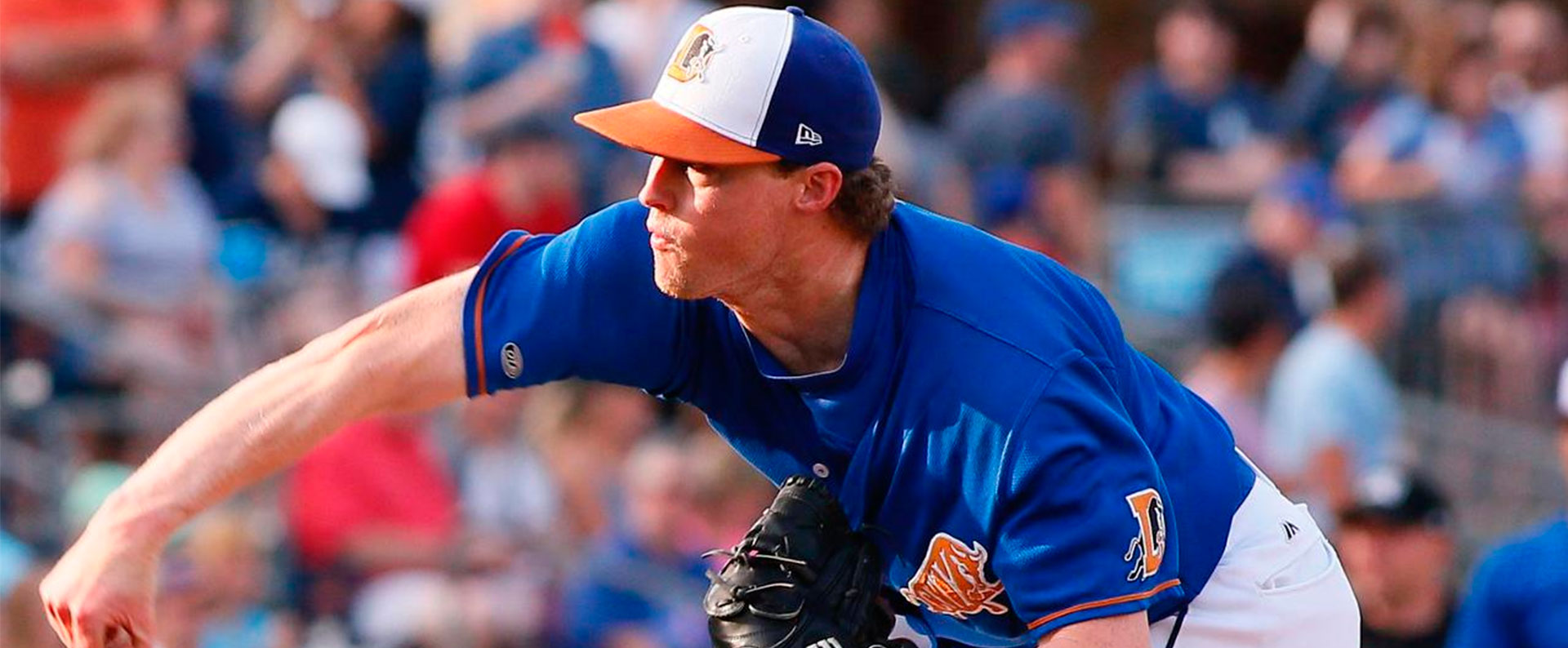
In July of 2017, the General Manager of the Durham Bulls contacted me to design the team uniforms that they would use for the next 3 seasons. The Bulls gave me full creative freedom with designing their uniforms, and it worked out great! Many of the uniform designs that didn’t make the cut were inspired by uniforms of the MLB teams that the Bulls were affiliated with throughout their history. After bouncing many designs and colorways back and forth, not only did we come up with a new jersey number type, but a new wordmark for the road uniforms, and a new “Bull City” mark for the alternate uniforms, which we know is going to be very popular with the city of Durham! The road wordmark is designed to pop off the chest while playing on the road in front of the opposing teams home crowd. I can’t wait to watch the team take the field in these uniforms for the next few years! Thanks again to Mike Birling and the Durham Bulls for giving me the opportunity to work on this awesome project with you!
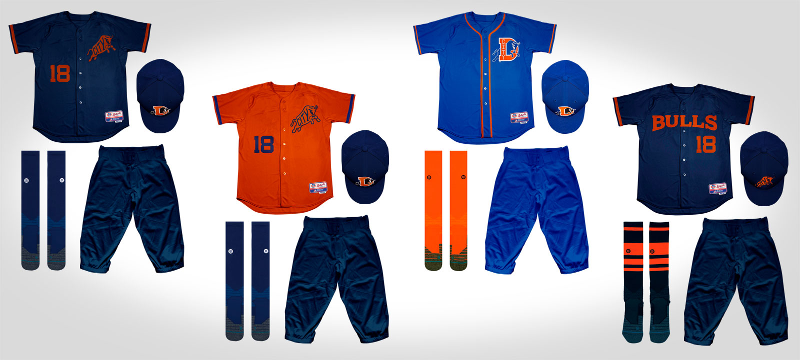
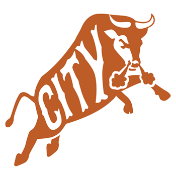
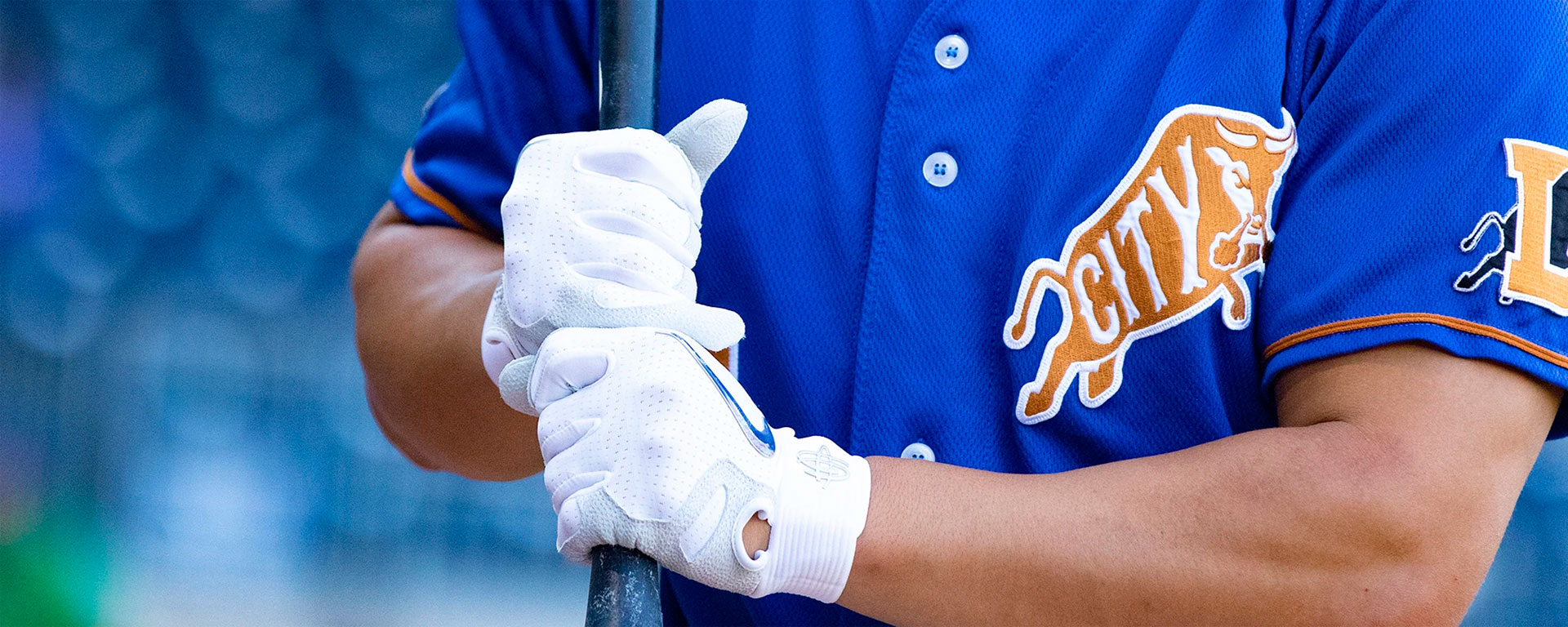
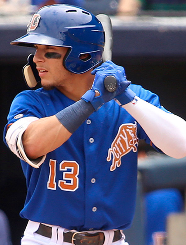
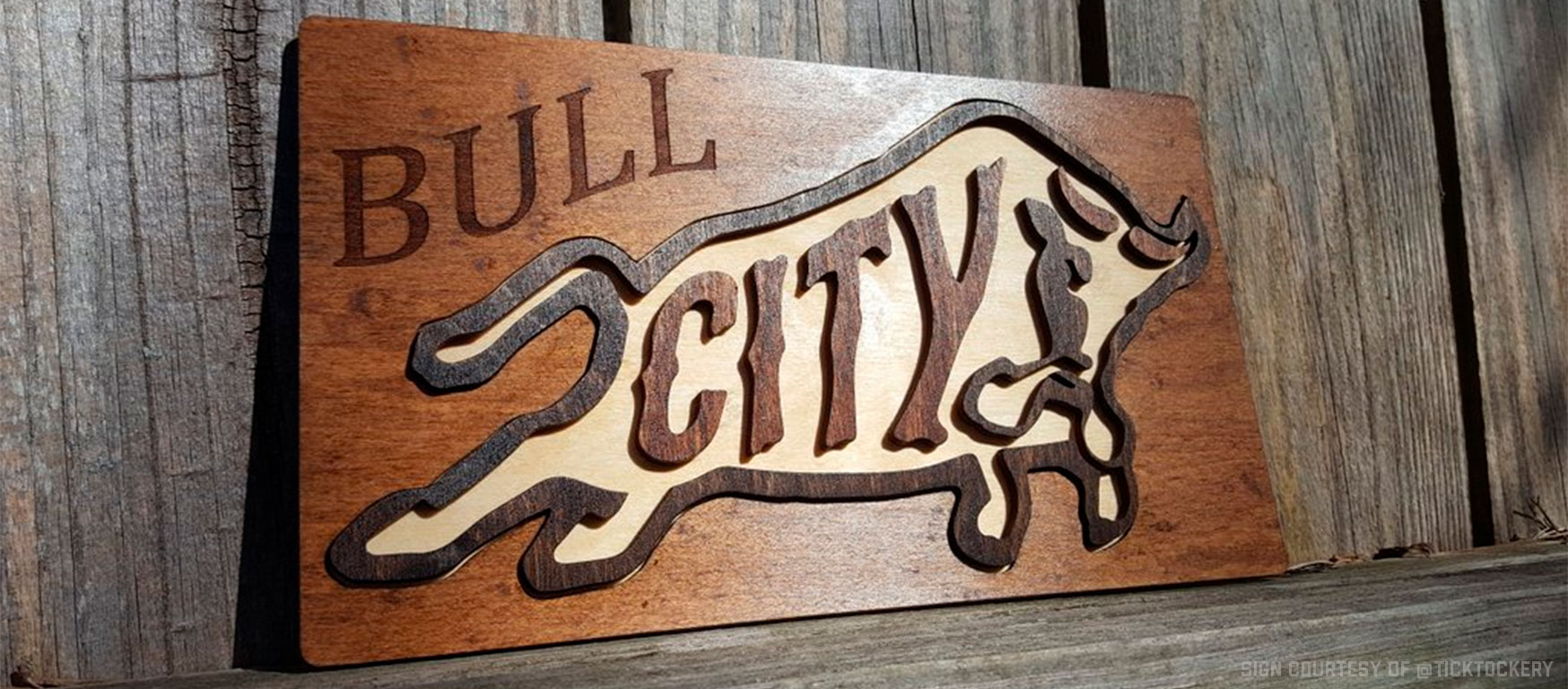
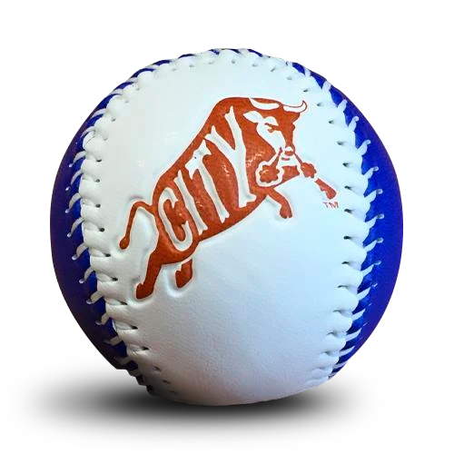
The Bull City design is one of my favorites. I came up with a couple concept sketches to bring Bull City to life. I went with the Bull City bull logo of course! Using just the bull from the infamous Durham Bulls logo, I created the lettering for, “CITY,” to fill the guts of this element. This design represents the winning Durham community with history and class.

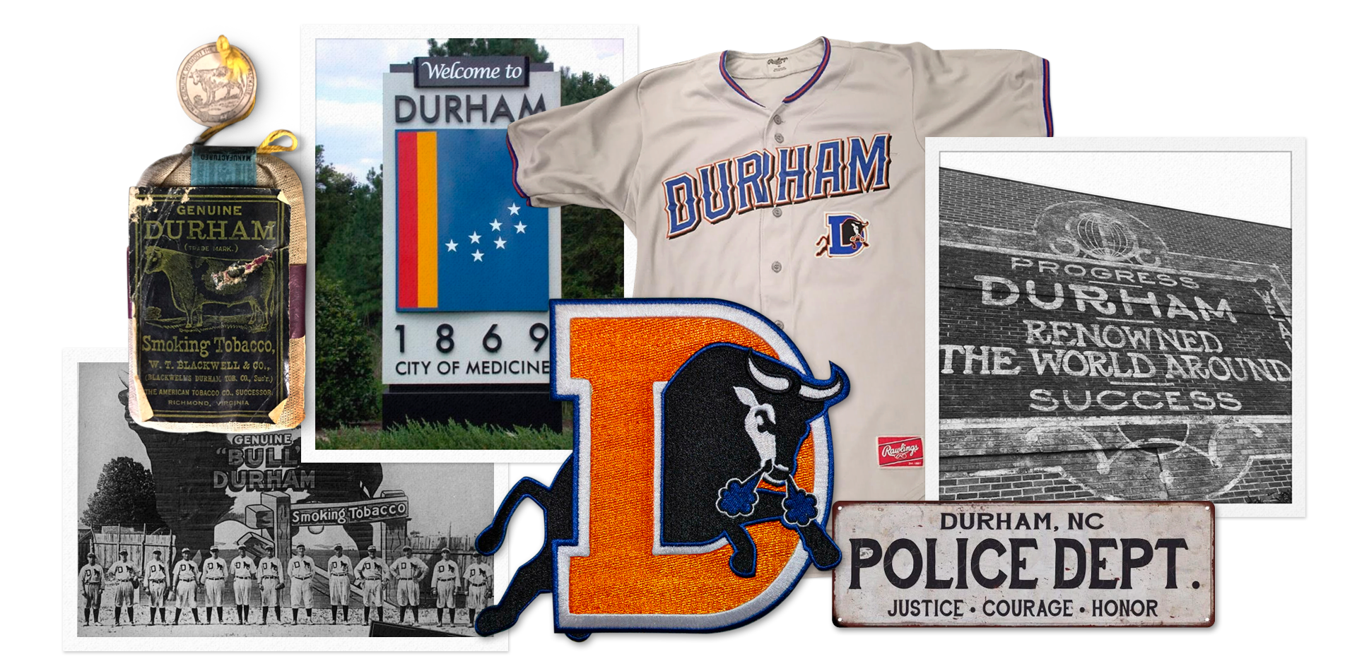
UNIFORM CONCEPTS